Thursday 25 November 2010

Development in Creative Thought and Structure - 23rd November

Developing Ideational Fluency


Creating ideas is one of the most, if not the most, important part of a visual communicator's creative process. Ideational fluency can be described as ideas that fulfill certain requirements, it focus' more on the quantity and range of ideas rather than the quality of ideas. There are three main ways in which to think up these ideas, these are:


  • Brainstorming
  • Classification
  • Mind Mapping
Classification consists of organised ideas whereby you recognise both the obvious and hidden denominators. Brainstorming is a way in which you can develop spontaneous thinking, this means the generation of more ideas. Mind mapping is more about the recall of ideas, it is an organised thought process  that develops as a network, this produces an encouragement in associations between different thoughts. 

Personally my preferred method of generating ideas is brainstorming, I find that if I sit down in a quiet place, this helps me to think properly and to get my ideas down onto paper and to generate more. Another way in which helps me to brainstorm is to talk to others about the main theme, this helps me to feed off of others thoughts and because everybody has different thought processes and ways of thinking, I find it really interesting to see how other people think and feel about the same thing as you, it generates so many different styles and ideas.


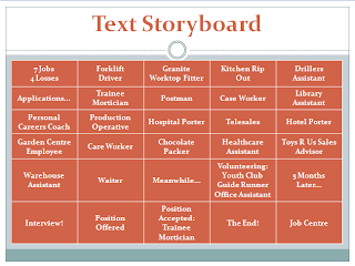
The above images are examples of my own ways of brainstorming, they show two sides of how I work, one being quite messy and thorough, and another being quite simple and orderly. I prefer to start off my brainstorm in a messy, unorganized way and to then organize it and make my ideas more neat and refined.

Getting Rid Of Assumptions

One problem with being a visual communicator is that you may start to think in the same ways, its good to keep an open mind with new ideas, these restraints can come in the form of education, rationality and experience. These restraints can have negative impacts on work which causes you to become more inhibited and it causes you to get into more of a routine, what you need is a fresh perspective that comes with each brief.

A way to keep these perspectives fresh is to look at things through similes, metaphors and analagies, these provide new ways of thinking by creating associations between objects that are different, another good thing about this method of thinking is that anything in your memory can trigger these thoughts.

Thursday 11 November 2010

Production and Outcomes - 9th November

Interpretation
One of the most important features when it comes to interpretation is the 'zeitgeist'. Visual communicator's rely on the spirit and ideas of time for inspiration and for different ways in which to express the same idea. One example of this would be Alice in Wonderland; so many different visual communicator's have produced this film but each version differentiates, whether it's through the film being darker and more sinister or through it being more light hearted and child-like.
Another example of different interpretations is the story of 'Adam and Eve'; as we know, the biblical story of Adam and Eve is all about temptation, with the both of them being told not to eat off of a particular tree, and it ending with the both of them being banished from the garden because they were tempted by a serpent and ended up eating off the tree they were told not to. Different artists have expressed different ways to represent this story. One of the latest examples of this is a film by Justin and Jeff Kanew, titled 'Adam and Eve'.
This film attempts to modernise the story by keeping the moral similar, yet placing it into the world we see today. In this instance we see a bunch of gross male room mates behaving lazily and rather slovenly, in America it would be described as a 'frat boy comedy'. The main principle of the film is that Adam and Eve meet and form a relationship, it turns out that Eve is still a virgin and the film is based on the problems that occur when two people come together but want different things, whilst trying to keep their own principles. 

When we compare the modern Adam and Eve to the traditional Adam and Eve, we can see a huge difference in interpretation. In this particular example, we have a painting by Jan Gossaert; we can see where the Kanew's interpretation has derived from regarding clothes, or rather a lack of clothes, but the main difference is the time in which each was produced. The film being produced in 2007, and the painting produced in around 1520, it is clear that interpretation is what has driven the film.


Testing Your Work

It is vital to every visual communicator to test their work and to find out what their specific audience think about that work, most creative's tend to test their work in similar ways, these mainly being:
  • publishing work
  • appearing in galleries
  • creating websites
  • forums/feedback pages
Through these different types of platforms, they are able to gain feedback and reactions, which helps to disseminate your own work. One of the easiest ways in which to test your work is to create a website, this enables you to publicise your own work but also for you to give information about yourself and your work; it also gives the public the option to contact you with their thoughts and feedback if they should wish to. An example of a good website is Marcus Walters':


The reason why this is a positive example of a successful website is that the visual hierarchy is clear, we first look at the image, then 'Marcus Walters' as it is bold and underlined in blue, we then look at the links below. This is a very simple example of publicising yourself but that is why it works. Another good feature on this page is that the image we see in the print screen is actually a slide show on the website, this feature works as it gives the audience a quick glimpse of the type of work Marcus Walters produces. Finally, we have the 'Blog' link and the 'Contact' link. Blogs are a good way for the public to get a better understanding of the visual communicator as it is a more personal part of their art. The 'Contact' link enables the audience/reader to get in touch with the visual communicator, whether it is in relevance to feedback or because the viewer wants the creative to produce something for themselves, it is a great way in which to promote themselves.

Thursday 4 November 2010

Development in Moving Image - 2nd November

Story Development -  Three Act Structure


Jean-Luc Godard - "Every movie needs to have a beginning, a middle and an end, but not necessarily in that order"

The first criterion in a film in order to fulfill the three act structure, is the need for a protagonist. Act one is complete when the protagonist makes a commitment that will eventually lead to the main action of the movie. In the film 'Hancock', the character John Hancock is the protagonist, his commitment in the film is when he agrees to let the character Ray Embrey change Hancock's public image for the better. To narrow this down even more it is when Hancock agrees to go to prison, the thought behind this deal is that once Hancock is locked up and therefore not able to stop crime, the crime rate will soar and therefore Hancock will be needed once more.

Criterion two is that the characters start off in a state of equilibrium, something then happens to disturb this state and it starts a sequence of events. By the end of the film the characters come to rest in a new, different state of equilibrium. In the chosen film, this happens when Hancock meets Mary, Ray's wife. It eventually turns out that Mary, too, is a superhero and that they are, in their world, practically married. This threw cogs in the works of Mary and Ray's marriage for a while. To complicate things more, when Hancock and Mary are nearer to each other they become mortal. When Hancock gets shot, he finds this out. In order to keep both of them alive, Hancock musters every last bit of strength to get as far away as possible from Mary, which leads into the other equilibrium as Ray and Mary carry on with their marriage and Hancock is busy stopping crime, which is the way it was before.

The third criterion is that the 'outer story' is usually accompanied by an 'inner story', in which the protagonist changes or grows emotionally, these changes are often formed from some form of romance. I would say that in this case it is when he finds out about Mary and him being together previously. When Hancock gets shot, I believe his feelings for Mary, and maybe even his respect for Ray, are what gives Hancock the strength to get as far away from them as possible, I also believe that this is when Hancock truly changed and became the person who Ray moulded him into.

 Pre-production - Character Design


In any film, there is always a lot of thought gone into the designing aspects of the characters. The main 4 aspects of a character are as follows:
  • Protagonist
  • Antagonist
  • Dialogue 
  • Stereotype
The character I have chosen to analyse is John Hancock, from the film 'Hancock'. In this particular film, Hancock is the protagonist as he experiences the conflict, in this instance the protagonist is viewed by the audience as a mix between good and bad.
In this instance I find it hard to differentiate between what/who the antagonist is. I would say it to be the public/law enforcement of Los Angeles as they give Hancock a hard time for stopping crime as he routinely damages millions of dollars in the city and keep giving him subpoenas and lawsuits. 

Hancock has been designed as an alcoholic and somebody who could care less about various damages caused along the way between each rescue mission; as long as he gets the job done. The dialogue represents this theme by using 'slang' and not talking the 'proper' way.

Hancock is also, by large, a stereotype, this derives from the alcoholic theme in the film. With being an alcoholic comes the generalisation that you don't care about anything but your addiction and that the addiction comes first. In this film it is true, however towards the end of the film, Ray Embrey decides to help Hancock and to change his public image, which is when he stops drinking alcohol and is moulded into what the public want from a 'superhero'.

3 more important features when designing characters are:

  • appearance
  • action
  • interaction


This image is taken from the beginning of the film, as you can see Hancock looks trampy; he's just spent the night drinking and ended up passing out on a bench, the little boy confronts him and basically says that he's a rubbish superhero.


The above image depicts Hancock as 'changed', he now has a particular image, he no longer looks trampy or alcohol abused, he is made in the image of the public.

Wednesday 27 October 2010

Reflective Visual Journal - 26th October

Drawing

A visual reflective journal is exactly what is says, it is a chance to gather all your ideas and jottings consistently over time and put it all into one place, this allows you to reflect on your work. Drawing is extremely important when it comes to the reflective visual journal as it puts the cogs in movement for ideas and development, which is what the journal is all about. It is a chance to work more privately, so even if you feel you are not good at drawing; it is a chance to get over that fear and to work through it. Granted, some may feel as though drawing is really not for them, you can however still incorporate other things into drawing, whether it's sticking things down or working on different types of material. One illustrator that works in this way is Lizzie Finn:


'I couldn't draw very well so I had to stick stuff down'.

Drawing can be used as problem solving, design speculation, creative play and as a visual organiser; the skills of drawing have been around for many, many decades! One of the earliest artists to work in this way was Leonardo Da Vinci:


Leonardo Da Vinci wasn't only an artist, he was involved in engineering, architecture, sciences, maths, invention, anatomy, botany and writing, amongst others; as you can imagine therefore, Da Vinci would have needed many, many sketchbooks to put all of his ideas and experimentation down on paper.

Reflective visual journals are so important, whether it’s for animation, illustration, photography, graphics, fashion, interior design or architecture, it is necessary to have a constant means in which you can experiment, develop, organise, collect, refine and evaluate, this all includes drawing as a means of channelling these into the journal.


Reflection

Reflecting throughout the reflective visual journal is another important part of the journey, perhaps the most important, as it gives somebody other than you the chance to understand exactly what you have done and why you have done it. In a way this is the most important part of the journal as the processes the visual communicator has used is more important than the final outcome, the reasoning for this is that through the reflective visual journal you develop and your initial ideas may change, all in all the journal will tell an outsider how you managed to get to the final outcome.

The following is a bad example of reflection through a journal, although there are drawings, there is no reflection what so ever, no writing to explain the processes or thoughts of the project. This leaves the reader clueless to what the communicator is actually doing.


The following is a better example of reflection during the visual journal, with explanations during the designing of the flyer along with experimentation and rough designs. In this small 'storyboard' of development, it is obvious what the communicator is trying to accomplish, and an outsider would be able to tell exactly what the communicator is trying to put across. One thing that could be better however is for more colour to be involved to make it slightly more interesting.


Visual language is all about getting attention and provoking emotional engagement, whereas textual language is good at providing detail and specifics, for a good all round reflection in a journal, both of these are necessary.

Monday 25 October 2010

Legibility and Visual Hierarchy in Graphic Communication - 12th October

Legibility

For any kind of visual communicator, one of the key principles is for the outcome to be legible for the audience/user, this is dependant mainly on layout which includes things such as font size, font style, font colour and the placing of images and text.


In this example of legibility, it is obvious to the reader which one is legible and which is illegible. The differences between the legibility for each is staggering, yet the changes to be made for it to be legible were so simple.


Mass Effect 2 - Text illegibility

Whilst I was doing my own research into illegibility I came across the problems of this xbox/ps3/PC game. User's have complained about the text being too small and that the colour of the text makes it even harder to read. Because the game relies on so much dialog and story to grab gamers, the fact that the gamers are having to squint to read the dialog is surely not part of the design!


Kate Moross - In Moross' work, illegibility plays a big part, after looking through her work this kind of eccentric play with words being too bright and with the sizes and font type differentiating so much; this would usually be said to be completely illegible, however for the type of work Moross does, I feel it works well on the whole, adding her own twist. The most important thing of course, is that you can read the writing, just maybe not as easily as others!

There are a number of different types of legibility, these include: printed communications, online communications, animated graphics and legible environments. It is just as important in each category that it is user sufficient and meets the requirements of the user/reader.


Visual Hierarchy

A visual hierarchy in a communicator's world is one of the most important things, what the communicator feels is the most important thing in a piece of work is what should 'stand out' the most, whether this is through colour, size or boldness. Different ways to distinguish these are: colour, typography, images, lines, weight, scale, composition, structure, grids, grouping and movement and sound. Most visual communicator's manage to grasp this concept well, these will be the most developed and important communicator's of today.


After looking at Kate Moross for the previous principle, I decided to look at some of her other work. Here she designed a billboard for Cadbury's. The visual hierarchy is quite obvious here. I would say that the colour's are the first thing you look at, because Cadbury's is a well known brand most people will know straight away what this advertises as purple and white are the famous Cadbury colours. The second thing you'll notice is the text/the illustration around it, being the two glasses of milk (a glass and a half full productions). Finally we notice the 'Cadbury' bar in the top right corner. As a whole this billboard definitely works and is definitely identifiable.


Here is another good example of a visual hierarchy, however this is done slightly differently to the previous one as this is based more on typography rather than illustration. The layout of the words and sentences on this website is simple yet effective. Straight away we're being welcomed to Rik Catlow's portfolio. Secondly we notice the Rikcat industries logo in the top corner, this is because it is bold and the colour's have been inverted so it is white on black rather than black on white like the rest of the design.

These good examples show us therefore, that a number of things point us to what we want to look at first, whether it is related colours and illustration or just simply making one sentence bolder and larger than the rest of the text. It also shows us how important a visual hierarchy is, without one, the audience wouldn't know where to look first.

Research and Development in Illustration - 5th October

Research


Paul Davis - 'Notebook after notebook after notebook, because I feel sick when I forget potentially good ideas'.

'I don't slack. I take photos. I draw. I scan. I photoshop'.
The dictionary definition of research is as follows:
  • Scholarly or scientific investigation or inquiry.
  • Close, careful study.
  •  To engage in or perform research.
  • To study (something) thoroughly so as to present in a detailed, accurate manner.


Although the dictionary gives the specific definition, it doesn't quite justify the importance of the effects and development that research brings; research is invaluable to ones own practice. Other descriptions of research are: investigation, studying, exploring, examining, making enquiries into... there are also two different directions in which to base your research, primary and secondary, both tend to be used throughout work. Primary involves collecting original data, this can involve creating questionnaires and collecting your own data, as well as interviewing and drawing. Secondary involves looking at data that already exists, this can involve studying books and surfing the internet.

Another important area of research for illustrators is producing visual research, this involves surrounding oneself with stuff that inspires, this can be achieved through drawing, collecting, reading and this can be done via different forms such as collecting images, videos and drawings.

Another illustrator other than Paul Davis that tends to do a lot of this is Jill Calder:


'I love drawing. I'd quite happily draw on anything (and quite often do) but some hot pressed Fabriano paper or a Moleskin notebook are my surfaces of choice'.

Through taking part in visual research/visual practice, it enables you to obtain a much deeper understanding of the specific subject in which you are researching into, which inevitably means a better outcome in your own work. This is why research in general is so important in a visual communicator's work.


Inspiration

Rian Hughes - Illustrator; this particular image was produced through working with Geri Halliwell on a set of children's books. To create this a certain amount of inspiration would have had to be produced, which i imagine would have mainly been obtained through Halliwell's children's books.


Inspriation can be gathered through many different ways, it is obtained through constant inquiry and through having a joy of finding things, in many ways it has a deep connection with research. Different workers are inspired through different means, some don't feel comfortable with drawing so instead they collect things and stick them down, some visual communicator's are inspired by anything and everything.

'It is the ability to think visually and the development of a personal visual language comes from learning basics, being open-minded, hard work, sustained practice and taking risks', 'Research should be broad and in-depth, enabling you to innovate, not imitate' - Wigan - Thinking Visually 2006. 

'Collecting things stimulates the brain. It helps you think of something fresher' - Tony Davidson and Kim Papworth.

So there it is, inspiration is gathered through keeping your eyes peeled all the time, working hard and therefore getting better, collecting various things to work from, experimenting with different materials, innovation and a constant inquiry into everything. Although working towards your own strength tends to enhance that specific area, experimenting could bring out a different side to your work, one that you didn't even know existed, and therefore inspiration has been ignited!

Tuesday 5 October 2010

Connectivity - 28th September


Notions of Originality

 
Diego Valezquez - The Rockeby Venus - 1640


Sam Taylor Wood - from the Soliloquy series - 1998-99

Some people view that the visual communicator who inserts other's work into their own is contributing to the near extinction of the understanding of the differences between creation and copy; in the modern world that we delve into today, there is a thin line, maybe even more of a blur, between these two factors. This leads us to...
Originality in art; impossible? Perhaps not all together impossible but becoming more scarce? The reasoning for this, one could suggest, is that because of the millions of pieces of art and visual communication that we see around us, it is hard not to be inspired by some of this work. One of the most valuable things to any kind of visual communicator is the ability to be inspired, hence why the majority of artist’s work stems from another artist, either by being visually noticeable or by its meaning.

In this example of originality, or rather unoriginality (being the comparison of Diego Valezquez and Sam Taylor Wood), the similarity would appear to be visually, even though there is such a huge difference in time from when Valezquez painted The Rockeby Venus until Sam Taylor Wood created her series of photographs, which includes the photograph above. Wood's inspiration, not only for the image shown above, but for her whole Soliloquy series, is derived from the tradition of religious paintings from the Renaissance and the Middle Ages, which explains why Wood has chosen the Rockeby Venus as one source of inspiration.

Nobody but the artist/visual communicator can say for sure what the meaning of their own work is, everything else is merely speculation; which is, the majority of the time, the visual communicator's desire. Perhaps in this sense, there is more originality in the visual communicator's world than some may think....


Can recontextualized ideas be contemporary?


John Constable - The Hay Wain - 1821


Peter Kennard - The Hay Wain with Cruise Missiles - 1983

Recontextualization introduces the process of extracting meaning from its original context and then reapplying it into another context, the outcome of this brings us an entirely new meaning. Can this be produced contemporarily? Would the difference in time from 1821 up until 1983 be classed as making something contemporary?

John Constable's work in general, let alone 'the Hay Wain' is noted for it's romanticism and sentimentality between the relationship of man and nature. His work depicts a stillness, that in the modern day, not many people are familiar with. So, for Peter Kennard to go ahead and bang a couple of cruise missiles in the middle of the painting, makes quite a bold statement. Kennard is known for his expression of political irony, juxtopositions and turning images on themselves, which recontextualizes an image and creates a whole new meaning.

Cruise missiles are, obviously, related to war, violence and politics, in 1821 cruise missiles were definitely not around, so for Kennard to mereley suggest placing a cruise missile in Constable's painting is to make it more contemporary as it is bringing an element that wasn't then created into the painting.